
Previewing Art Online
What will my art look like?
If you're new to buying art online, you might be wondering, "What will this really look like?" It's a natural thing to ask.
Fortunately, previewing photography editions online is simpler than, say, buying a painting or drawing. This is because the image you view in the product listing for a limited edition photograph is made from the same image file that the actual artwork is printed from. Although this aspect is advantageous, it's not the end of the story.
Key Takeaways
- To get the most accurate preview of your artwork, observe it on multiple screens and at a large size to assess detail and color.
- Printed photographs differ slightly from their digital version, with prints often showcasing brighter colors and more detail. In most cases, this is not noticeable.
- We offer a 100% satisfaction guarantee with options for a refund or exchange for any reason.
How to Properly Preview Art Online
- Use a device no smaller than a laptop for final viewing
- Examine each photograph in the product listing
- Click full-screen view, then zoom in all the way
Before you purchase, check out each image available on the product listing page. It's strongly recommended you use a laptop or desktop screen. Phone screens are often too small to fully appreciate an artwork that is 2 to 4 feet (0.6 to 1.2 m) wide. You might pass up an artwork that you'd really love had you seen it in full detail.
Although the factory standards of most devices show color well, the colors will vary from device to device. Try a variety of screens to view the same artwork.
Some Technical Stuff
A photo is a photo is a photo, right? Not really. The technology that displays an image by emitting light from a screen is very different from the technology that puts ink on paper to create an image. These two processes are so different that they not only have separate names, but they use different sets of primary colors. Your device screen uses additive color theory, and the printed artwork uses subtractive color theory. Your screen uses red, green, and blue as three primary colors. The printed photographs use twelve colors that include various intensities of cyan, magenta, yellow, and black to produce a larger range of colors.
If none of this sounds familiar or vaguely like what you learned with paints in elementary school, the takeaway is that a device screen can't produce every color that you may see in your photograph. Your artwork contains far more colors than is possible on even the best display screens. You will also see a richer range of lights and darks in your physical photograph.
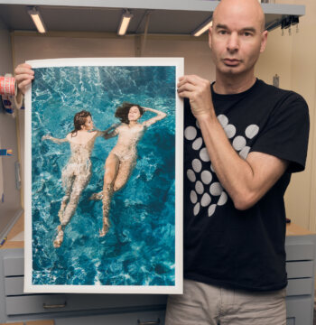
For example, there are some bright blues in many of the swimmer artworks that simply cannot be accurately displayed on many screens. The blue colors are just more vibrant that what common screen technology can predictably display.
Newer, higher-end devices produce more accurate color in most cases. Not only is the technology better than old or inexpensive devices, but the color balance of some screens can "drift" over time if they've not been recalibrated. Check the color of the artwork you want to buy on your newest device. Some screens may display very dark colors as black or very light colors as white.
The good news is that in most cases you won't notice any difference. Any difference you notice will likely be that there is more detail and that colors are brighter. We're so confident you'll love your art photography from Aaron Knight, we offer a 100% satisfaction guarantee with options for money back or exchange for any reason. If you're concerned or curious, you can order a paper and ink sample.
There is an entire industry segment built on color accuracy. Even the choice of paper affects how colors will turn out. Artist Aaron Knight has carefully chosen a printing process and specific materials for vibrant, appealing colors in the final artwork.

A basic check of your screen
Take a close look at the graphic to the left. Try to see that it is divided into four squares, each with a logo in it. There are two very dark squares that are very close in value; there are also two very light squares that are very close in value. If you don't see all four squares and all four logos, don't worry. The tones are very close in value.
Now try looking at this graphic on a different device. You can also try adjusting the display brightness and contrast.
This can demonstrate that the art you receive can contain more details and colors than a digital screen can display.